Friday, 13 December 2013

Magazine Front Cover Research


Masthead -
The font of the masthead is very simple yet eye catching because of the thick bold lines. The masthead follows the colour scheme of the whole magazine front cover, the colour of the masthead is white which represents purity which shows the magazine is respectable. It is position at the top of the front cover which is where peoples eyes are naturally drawn to, therefore this is what people will see first and the masthead can inform people immediately of what type of magazine it is. Vogue means trend and style in french which if people know this they will know the magazines main focus will be fashion and what is on trend right now, so this will encourage lovers of fashion to read this magazine.

Cover Image -
The cover image is Cara Delevingne who is currently in the media all of the time, she is the main focus of everybodys eyes. If a well known and well loved person is used for the cover image a wide range of people will read the magazine if they have an already existing fan base. Cara is looking directly at the camera which engages with the audience as its almost as if they are looking at them tempting them to read the magazine. It is a mid shot with the facial expression of a chocolate box, her mouth is slightly open and there is an emphasis on her flawless face and body which links with the writing about Cara to the right of her face which is 'Model of the year' because models are known as flawless and beautiful.

Lead Story -
The lead story is in a larger sized font which dominates the rest of the text on the front cover which attracts the audience in if they like what the lead story says, in this case it is about Cara Delevinge who is the cover image so therefore people will expect a lead story about her as she is being used as the main focus of the magazine. The lead story is in the same font and colour as the rest of the text. The lifestyle topic of fashion is made clear by the use of a model because models are used to showcase fashion and are surrounded by it.

Secondary Lead -
The secondary lead is 'spring fashion special' which also shows the lifestyle topic is fashion and it links with the masthead and cover image as models take park in fashion shows that use seasons as a topic for their style of fashion.

Additional Lines -
'Red carpet style guide' and 'what does your handbag say about you' also refer to fashion which shows the lifestyle topic of the magazine is fashion. They also follow the colour scheme of the magazine front cover which makes it look professional.

Colour Scheme -
The colour scheme of the magazine front cover is red, white and blue and the main image also includes pops of red and white. The colours are also in the UK flag which represents Cara being a well known model who is British. The colours are vibrant and confident which colour represent Cara as a model or the current spring fashion trend. Also if the colours are bright on the front cover they stand out from the other magazines and could therefore have a better chance of being bought over other magazines on the shelf.




e - Media Research

I need to create three pages of a website, to demonstrate a promotional strategy for Synopticity Productions' programme and to do this I need to involve the audience. To involve the audience I will include a forum so people can post their own images of their fashion taste and other people can comment on the pictures and from this an online community will be formed. I will also support sponsorship and use fashion companies such as H&M and Topshop to advertise their clothes and from this my company will gain money.


This is an example of product placement on Elle magazine. This is an online version of a fashion magazine using product placement. They will be paid for picking these items as their top items and this will benefit the company's that sell the items because more people will buy the items and elle will get money for advertising them.


I have researched blogs where the bloggers have been sent products to review.

This blog is by Zoella who is a popular blogger as well as being a well loved youtuber. She is young and interested in fashion and beauty and is an idol and inspiration for young people. Her blog is http://www.zoella.co.uk/

Zoe got to visit a launch of a new makeup range from the brand Illamasqua and she has been allowed to chose some items to review on her blog. She has been given this makeup for free, she benefits from this as she got given free high end makeup and by Zoella being a popular blog a lot of people who are interested in makeup will see the products and want to buy them as this is a positive review.
The blog also has adverts around the blog post which are beauty related as the company advertising the products knows the blogs audience is interested in beauty, Zoe (who runs the blog) will be paid for letting the company advertise their products on her blog.

The content of this blog is beauty and fashion, which is the topic of lifestyle my programme will be. I have researched this genre of blog so I can see how they are managed and what products are shown and talked about, all of the products will be current and popular therefore I can find out what my target audience are currently loving and I can produce similar content to cater for them myself.

The design of this blog is very feminine which shows the target audience is girls, and the owner of the blog is female therefore the girls who read the blog can look up to her and relate to her. The blog also includes a lot of pictures to go with the text so that it isn't as daunting to people and people wont think it is boring and too much for them to sit down and read. The pictures are of the products talked about in the text which helps the audience put a face to a name and get to know the product better and from the images they get to explore how they look and recognize them so they can go out a buy the products if they like them.

Magazine double page spread research


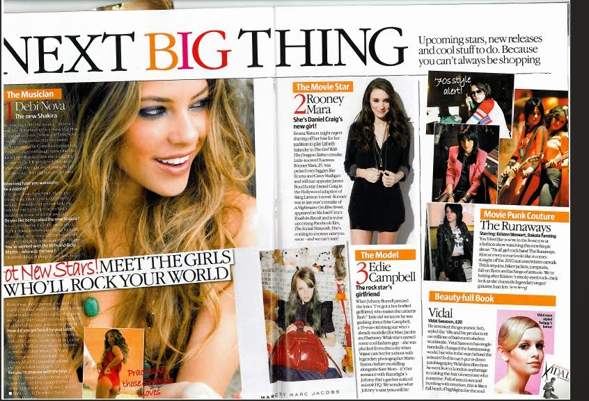
Headline - 'The next big thing' draws the reader in by being at the top of the page and using persuasive language. The language used makes people know if they read this magazine they will have a heads up on future trends and be up to date with what is happening within the popular media.

Sub Heading - 'Up coming stars, new releases and cool stuff to do. Because you can't always be shopping' expands on the headline by explaining what the next big things are according to them, this informs the reader what the double page spread will be about in more detail and from this they can decide whether it is an article of their interest.

Columns - The text on the page is set out in short columns which makes it easier and let heavy for the reader to understand and if it looks simpler to read they will be more likely to read it as it wont be as time consuming. The columns of text are broken up by images, this is because fashion magazines are more picture based as the clothes need to be seen to make an impact.

Picture Caption - Next to the images their is a short snippet of who the picture is and explains in a short phrase what the piece of text will be about. This makes it easier for the reader to decide whether they want to know more and read the column of text. The phrases are exaggeration which persuade the reader to read the text instead of just browse at the images.

Image - The double page spread is very picture based, making it clear that the magazine is a fashion magazine. The biggest picture has the largest amount of text to go with it, showing that this is the most important part of the pages. This is the picture that dominates one whole side of the pages.


I plan to make a double page spread on an interview with a current female style icon my chosen topic is fashion therefore I need to chose someone with a sense of style and who is a style icon to be the main focus. I will then interview them and make the interview into a double page spread. My interview is going to be with Niomi Watson who always looks put together. Her dress sense is inspired by 90's fashion and she is known for her unique style. My target audience is teenagers and young adults who are female so my presenter has to be female. They need to be a current style icon who is respected in the industry and someone who my target audience can relate to. Young girls are always looking for someone to look up to so the presenter has to be someone who has the traits and qualities to be a good role model for my audience so they connect with her and read the magazine. I am using an Emma Watson interview as an example from a fashion magazine as that will be the magazine I am creating and Emma Watson is a well loved, respected role model for young girls. She is also well known for her happy attitude and great sense of style which is what the person I am interviewing will need to have. Emma is young and has a youthful glow about her which makes young girls feel connected to her, this is how I want my chosen female to be like. They way the magazine double page spread is set out is how i want my magazine to look, it is simple yet classy. That is the reputation I want for the company I am designing for so not only the young girls are attracted to it their parents will be also.


Image - There is an image of who the interview is about dominating one side of the page, this shows who the interview is with and attracts people to read is as a big picture catches the readers attention if they like who is in the image. In this case Emma Watson fans will be attracted to this interview if they see the dominant image of Emma. She is dressed fashionably as it is a fashion magazine and this is how I want my girl to look like to represent the topic of my magazine. The picture is in black and white and this gives the magazine a classy feel, this is the impression I want for my magazine so people know the company is a respected company and is suitable for young people.

Pull Quote - There is a quote from the interview overlaying the dominant image to draw in the reader by giving them a taste of the interview so if they are flicking through it will catch their attention and will let people expand on the quote by reading the whole interview if they want. The quote is the most interesting and eye catching part of the interview so the whole interview seems exciting as people will judge it by using the quote and this will make them want to read more.

Drop caps - The first letter of the interview is larger than the rest of the text, this indicates the start of the text and the reader knows this is where they begin to read.

Columns - Columns make the text easier to read and makes it look as if there is less to read, therefore people are more likely to read it if it looks less daunting. I will use columns as my audience is teenagers and young adults and they may not have enough time to sit down and read lots of text that looks like a large amount.