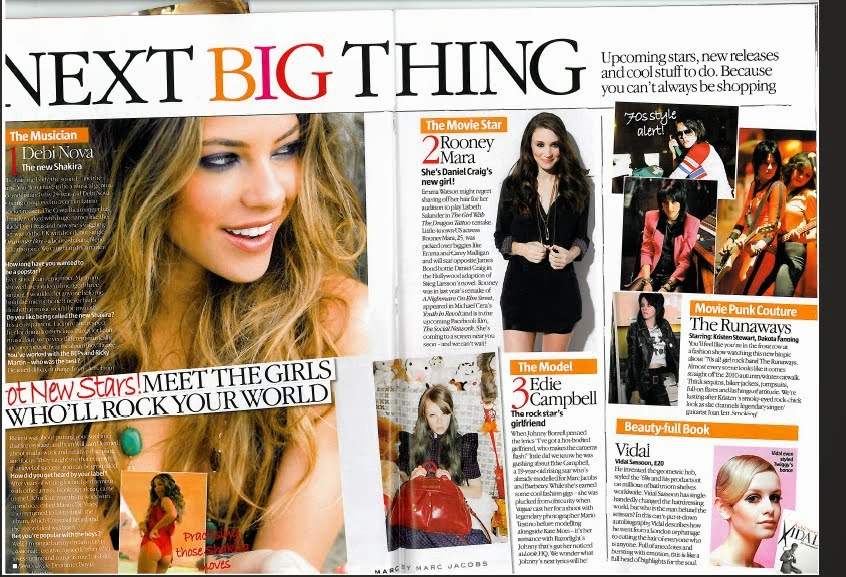
Headline - 'The next big thing' draws the reader in by being at the top of the page and using persuasive language. The language used makes people know if they read this magazine they will have a heads up on future trends and be up to date with what is happening within the popular media.
Sub Heading - 'Up coming stars, new releases and cool stuff to do. Because you can't always be shopping' expands on the headline by explaining what the next big things are according to them, this informs the reader what the double page spread will be about in more detail and from this they can decide whether it is an article of their interest.
Columns - The text on the page is set out in short columns which makes it easier and let heavy for the reader to understand and if it looks simpler to read they will be more likely to read it as it wont be as time consuming. The columns of text are broken up by images, this is because fashion magazines are more picture based as the clothes need to be seen to make an impact.
Picture Caption - Next to the images their is a short snippet of who the picture is and explains in a short phrase what the piece of text will be about. This makes it easier for the reader to decide whether they want to know more and read the column of text. The phrases are exaggeration which persuade the reader to read the text instead of just browse at the images.
Image - The double page spread is very picture based, making it clear that the magazine is a fashion magazine. The biggest picture has the largest amount of text to go with it, showing that this is the most important part of the pages. This is the picture that dominates one whole side of the pages.
I plan to make a double page spread on an interview with a current female style icon my chosen topic is fashion therefore I need to chose someone with a sense of style and who is a style icon to be the main focus. I will then interview them and make the interview into a double page spread. My interview is going to be with Niomi Watson who always looks put together. Her dress sense is inspired by 90's fashion and she is known for her unique style. My target audience is teenagers and young adults who are female so my presenter has to be female. They need to be a current style icon who is respected in the industry and someone who my target audience can relate to. Young girls are always looking for someone to look up to so the presenter has to be someone who has the traits and qualities to be a good role model for my audience so they connect with her and read the magazine. I am using an Emma Watson interview as an example from a fashion magazine as that will be the magazine I am creating and Emma Watson is a well loved, respected role model for young girls. She is also well known for her happy attitude and great sense of style which is what the person I am interviewing will need to have. Emma is young and has a youthful glow about her which makes young girls feel connected to her, this is how I want my chosen female to be like. They way the magazine double page spread is set out is how i want my magazine to look, it is simple yet classy. That is the reputation I want for the company I am designing for so not only the young girls are attracted to it their parents will be also.

Image - There is an image of who the interview is about dominating one side of the page, this shows who the interview is with and attracts people to read is as a big picture catches the readers attention if they like who is in the image. In this case Emma Watson fans will be attracted to this interview if they see the dominant image of Emma. She is dressed fashionably as it is a fashion magazine and this is how I want my girl to look like to represent the topic of my magazine. The picture is in black and white and this gives the magazine a classy feel, this is the impression I want for my magazine so people know the company is a respected company and is suitable for young people.
Pull Quote - There is a quote from the interview overlaying the dominant image to draw in the reader by giving them a taste of the interview so if they are flicking through it will catch their attention and will let people expand on the quote by reading the whole interview if they want. The quote is the most interesting and eye catching part of the interview so the whole interview seems exciting as people will judge it by using the quote and this will make them want to read more.
Drop caps - The first letter of the interview is larger than the rest of the text, this indicates the start of the text and the reader knows this is where they begin to read.
Columns - Columns make the text easier to read and makes it look as if there is less to read, therefore people are more likely to read it if it looks less daunting. I will use columns as my audience is teenagers and young adults and they may not have enough time to sit down and read lots of text that looks like a large amount.
No comments:
Post a Comment